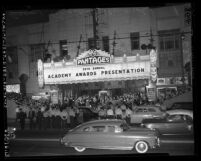
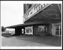
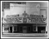
The design evolved into a storefront remodel using every device to capture attention from the passerby. The strong diamond pattern applied to the upper story, the series of vertical posts applied at street and the paneled entry doors draw attention to the centerpiece, the curving neon-outlined marquee. A curved box office at the sidewalk and poster cases framed in wavey edged box frames are overwhelmed by the other design elements. Here the chief purpose of the design is to draw attention to the storefront, using a variety of cheap applied elements without regard for design integration.
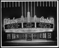
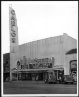
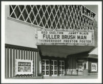
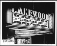
This night photo of the marquee with its neon strips and interior illuminated sign was taken as a publicity photo for Bevelite, the manufacturer of the removable letters used to spell out the names of the show and the stars on the marquee.