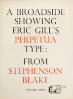
When folded, this broadside reads: “A Broadside Showing Eric Gill’s Perpetua Type: From Stephenson Blake.” When opened halfway there is an essay on “Eric Gill as Type Designer.” When open fully there is a description and examples of the Perpetua typeface.
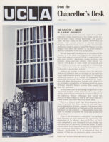
2 copies of a publication from UCLA called “From the Chancellor’s Desk.” There is an image of Gill’s Muliere accompanying an article entitled “The Place of a Library in a Great University.”
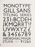
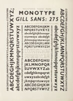
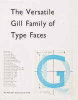
Sample alphabets in Monotype Gill Sans Bold Series 231, 262, 275, 321, 343, and 468. Printed by the Monotype Corporation. Shows several different point sizes.
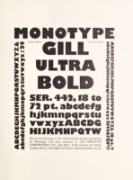
Sample alphabets in Monotype Gill Ultra Bold Titling Series 442, 18 to 72 pt. printed by the Monotype Corporation. Shows several different point sizes.
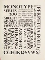
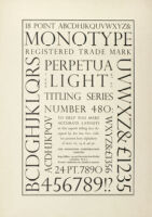
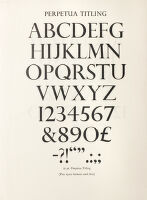
Alphabet and other text printed in Perpetua Titling Capitals. One side of the sheet shows capitals in Series 258-10 to 72 point, the other side shows Light Titling Series 480-18 to 72 point. Printed by the Monotype Corporation.
Order of Mass for a Catholic Liturgy. Mockup of intended order of service, with text printed in black on both sides and Gill’s holograph sequence notes and decorations in red.
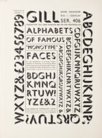
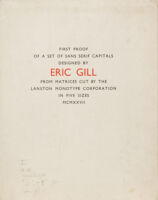
“First proof of a set of sans serif capitals designed by Eric Gill from matrices cut by the Lanston Monotype Corporation in five sizes MCMXXVII.” From Gill’s own collection with an ms correction in the text and some lettering by him (in pencil) on front wrapper. Unique state of this important typographical work.